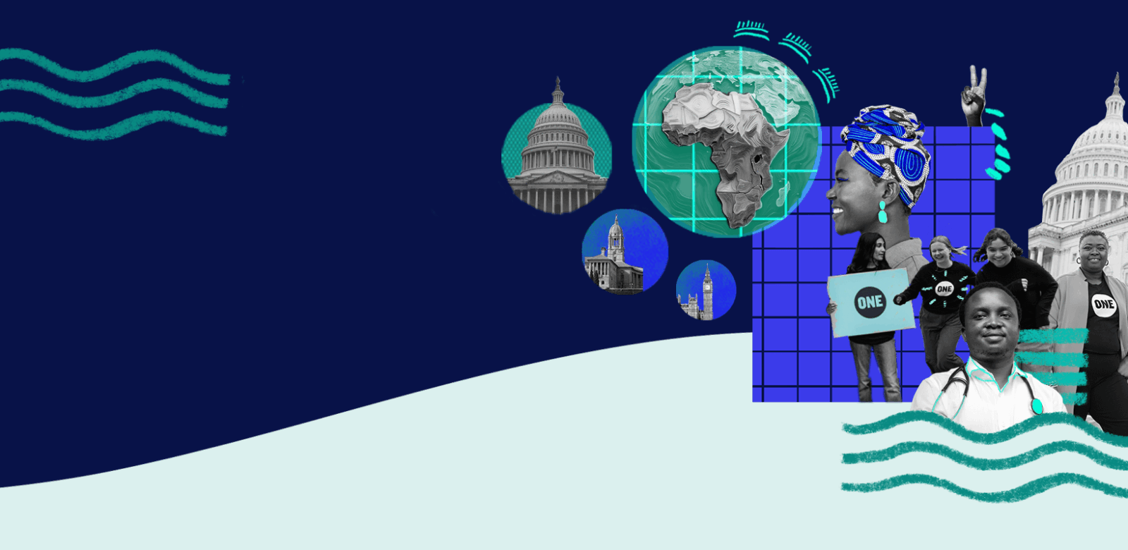
WE FIGHT FOR A MORE RESILIENT, EQUITABLE FUTURE FOR ALL.
The latest
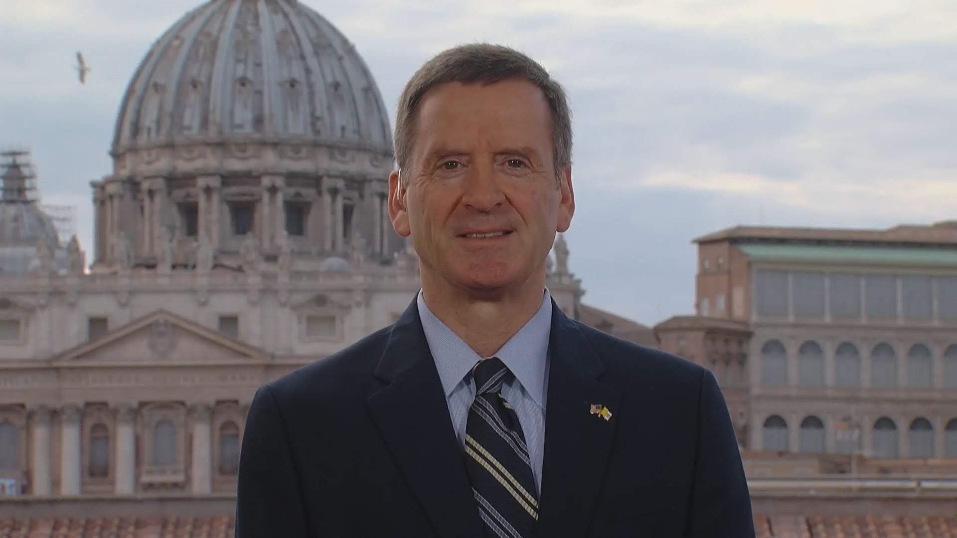
The ONE Campaign Names Ambassador Mark Green as its next President and CEO

More Than a Match: Exploring North America – Africa Connections Through Soccer
US-Africa Trade: An Unfinished Story
Our Impact
At ONE, we know to make change happen. We bring together cutting-edge data analysis, trusted messengers, and decades of expertise to build political capital and drive policies and investments to drive a more resilient, equitable future.
STRONGER INVESTMENTS
We have helped secure $1 trillion in new investments to drive economic prosperity and create a safer, healthier world.
BETTER LAWS
We reach key decision-makers in global capitals, with 2 decades of impact and 25 million actions taken by activists.
African Agency
We push for Africa’s fair seat at the global decision-making table, including the African Union’s permanent G20 seat.
If you believe everyone has the right to a life of opportunity and justice, no matter where they live, and if you believe ordinary people can change the world, then join us.